After 1 and half year of work, RedUI reaches it's BETA!
See the complete list of changes here.
Monday, April 28, 2014
Saturday, April 26, 2014
Some important internal methods
In case anyone is interested in creating new controls for redui, here is the description of the most important internal methods that the controls rely upon.
initializeControlFromModel
Creates and initializes any redui control from model.
Internally calls 'create' and 'initializeFromModel' control-specific handlers.
It's only necessary to directly call this method from the parent control that is not a generic container (i.e. does not extend IContainerControl), like ContextMenu, that does not allow to add any control type as a child, thus does not extend IContainerControl interface.
For the controls that are generic controls, like GroupBox, AccordionPanel etc, it's enough to call initializeInnerControls.
initializeInnerControls
Creates and initializes inner controls of a given control from model.
Used by container controls (GroupBox, AccordionPanel etc) to initialize the controls collection.
toHtml
Returns the HTML for a given control.
Relies on mustache template engine to render the HTML.
Templates are retrieved once and cached on the _templates object.
Templates are retrieved with redui version as a url query parameter, that forces the new version of template to be loaded.
localize
Localizes the label.
This function is used called from templates to localize every label/text defined in the model.
Localization only happens in Globalize.js is found.
bind
Standard behavior for data binding that is attached to every databound redui control.
Should only be called as a method of a redui control (requires 'this').
bindRecursively
Walks through the hierarchy of controls and binds them to the data.
Makes the data object (or it's property, in case the control is inside container that changes the context)
accessible from the bindingContext property.
If the property that the control is bound to is a function, calles the function.
If the function has a property 'subscribe' it is considered to be ko.observable, in which case the control
automatically subscribes to changes.
Also binds all the inner controls to the data. Normally it is not required to call this method directly.
updateElementValue
Updates the value of the rendered element, the value that is seen by user.
For that, relies to the control-specific handler.
Normally it is not required to call this method directly.
validateControl
Performs the control validation.
In the current implementation is aware of the control internal structure, so walks the inner controls on its own.
activateControl
Helper to call the control-specific activation handler.
Generic containers (GroupBox, AccordionPanel etc) don't have to call this method directly
and can activate their children by calling activateInnerControls.
activateInnerControls
Activates inner controls of the given control.
subscribeToChange
Subscribes the databound control to change event.
Change triggers binding update.
Thursday, April 24, 2014
How to create a pager in javascript
1. Take a piece of paper and draw

2. Test it on paper

3. Pseudo-code
// Check if there are pages at all
if (pagesTotal < 1) {
 return;
}

// First visible page
firstVisiblePageNo = pageNo - visiblePositions / 2 + 1 = 12

// Adjsut first visible page
if (firstVisiblePageNo < 1) {
 firstVisiblePageNo = 1
}

// Number of pages in sequence
sequentialPages = visiblePositions
lastPageNoInSequence = firstVisiblePageNo + visiblePositions - 1 = 17

// Adjust last page in sequence
if (lastPageNoInSequence > pagesTotal) {
 lastPageNoInSequence = pagesTotal

 // If reached the last pages on the right, get more pages from the left
 if (lastPageNoInSequence - firstVisiblePageNo + 1 < visiblePositions) {
  firstVisiblePageNo = lastPageNoInSequence - visiblePositions + 1;
 }
 // Adjsut first visible page
 if (firstVisiblePageNo < 1) {
  firstVisiblePageNo = 1
 }
}
if (lastPageNoInSequence < pagesTotal) {
 sequentialPages -= 2;
 showEllipsis = true
}

for (currentPageNo = firstVisiblePageNo; currentPageNo <= lastPageNoInSequence; currentPageNo++) {
 render page(currentPageNo)
}

if (showEllipsis) {
 render ellipsis
 render page(pagesTotal)
}
4. Debug it on paper (or in notepad)
1 2 {3 4 [5] 6} 7 8 9 10 11 12 13 14 15

{1 [2] 3 4 5 6} 7 8 9 10 11 12 13 14 15

{1 [2] 3 4}

1 2 3 4 5 6 7 8 9 {10 11 12 13 [14] 15}

1 2 3 [4] 5 6 7

// Const
visiblePositions = 6

// Given
pageNo = 14
pagesTotal = 15
5. Code it
6. Test it

7. Enjoy
Do you like the result?
Feedback appreciated!
Wednesday, April 23, 2014
Anatomy of a Control Template
In this post I will explain some rules I use to create a template for a control.
Let's look at the template for a TextBox control.
What we see here?
This is the most important part of the template.
id - stores the unique id of the control, something like 'redui_control_123'. Unique id are assigned to every control upon its creation.
name - the name of the control, that you provide in the model.
for example, if you defined you TextBox as follows:
the name attribute will be filled with 'firstNameTextBox'.
data-name - the same as name attribute. Not every HTML tag allows name attribute, but data-name attribute is always available.
class - here we put the class that reflects the control type. It has prefix 'redui-' followed by the type that you use in the model. For instance, for TextBox it is 'redui-textbox'.
Label is optional, so when it is not set, this part of the template is not rendered. This part of the template is almost identical for every control, only class is different.
By convention, this div has an id that matches the control id with suffix '_template'.
Second, it has class that matches the control class with suffix '-outer', in our case, 'redui-textbox-outer'.
The most important, when you apply the custom CSS class in the model, it is set on this outer element.
So for example, if apply class 'myControl',
It will be set on the outer div.
Naturally, visibility ('redui-hidden' class) is also applied to the outer div.
By convention, this div has an id that matches the control id with suffix '_validationerrorbox'.
For controls that support validation this div is used to show the validation message.
Every control can have a context menu attached to it. To show it you need to add this section:
For the container controls you need to render inner controls. The following section takes care of it:
redui-hidden
Hides the control
redui-focusable
When the window is open, the focus goes to the first control that has redui-focusable class
redui-valid
Controls whether validation div should be visible
redui-activated
For some controls the special behavior is enabled upon activation. For example, GridViewColumn subscribes to click event to allow sorting. To avoid the double activation, the class redui-activated is set on such a control after the behavior is activated
redui-disabled
This class is used together with commands. When the command is not available (canExecute returns false), controls that are bound to this command get the class redui-disabled
Let's look at the template for a TextBox control.
<div id="{{id}}_template" class="redui-textbox-outer redui-valid{{#model.cssClass}} {{model.cssClass}}{{/model.cssClass}}{{#model.isHidden}} redui-hidden{{/model.isHidden}}">
  {{#model.label}}<label for="{{id}}" class="redui-textbox-label">
    <span>{{#_localize}}{{model.label}}{{/_localize}}: {{#model.isRequired}}*{{/model.isRequired}}</span>
  </label>{{/model.label}}
  <input id="{{id}}" name="{{name}}" data-name="{{name}}" class="redui-textbox redui-focusable" type="{{model.inputType}}" />
  <div id="{{id}}_validationerrorbox" class="redui-validation-errorbox"></div>
{{#contextMenu}}{{{_toHtml}}}{{/contextMenu}}</div>
What we see here?
1. Main tag
Every control has an HTML tag that it is build around. For the TextBox it is, natuarally, the input tag.<input id="{{id}}" name="{{name}}" data-name="{{name}}" class="redui-textbox redui-focusable" type="{{model.inputType}}" />
This is the most important part of the template.
id - stores the unique id of the control, something like 'redui_control_123'. Unique id are assigned to every control upon its creation.
name - the name of the control, that you provide in the model.
for example, if you defined you TextBox as follows:
{
 "name": "firstNameTextBox",
 "type": "textbox",
 "label": "First Name",
 "bindsTo": "firstName"
}
the name attribute will be filled with 'firstNameTextBox'.
data-name - the same as name attribute. Not every HTML tag allows name attribute, but data-name attribute is always available.
class - here we put the class that reflects the control type. It has prefix 'redui-' followed by the type that you use in the model. For instance, for TextBox it is 'redui-textbox'.
2. Label
Most of the controls have label{{#model.label}}<label for="{{id}}" class="redui-textbox-label">
<span>{{#_localize}}{{model.label}}{{/_localize}}: {{#model.isRequired}}*{{/model.isRequired}}</span>
</label>{{/model.label}}
Label is optional, so when it is not set, this part of the template is not rendered. This part of the template is almost identical for every control, only class is different.
3. Outer div
One HTML tag is not enough even for the simplest control. In case of TextBox, it requires at least 2: input and label. To make it easier to target various tags with CSS-selectors they all are wrapped in one outer div.<div id="{{id}}_template" class="redui-textbox-outer redui-valid{{#model.cssClass}} {{model.cssClass}}{{/model.cssClass}}{{#model.isHidden}} redui-hidden{{/model.isHidden}}">
By convention, this div has an id that matches the control id with suffix '_template'.
Second, it has class that matches the control class with suffix '-outer', in our case, 'redui-textbox-outer'.
The most important, when you apply the custom CSS class in the model, it is set on this outer element.
So for example, if apply class 'myControl',
{
 "name": "firstNameTextBox",
 "type": "textbox",
 "label": "First Name",
 "bindsTo": "firstName",
 "cssClass": "myControl"
}
It will be set on the outer div.
Naturally, visibility ('redui-hidden' class) is also applied to the outer div.
4. Validation div
By convention, this div has an id that matches the control id with suffix '_validationerrorbox'.
For controls that support validation this div is used to show the validation message.
5. Context menu
Every control can have a context menu attached to it. To show it you need to add this section:
{{#contextMenu}}{{{_toHtml}}}{{/contextMenu}}
6. Inner controls
For the container controls you need to render inner controls. The following section takes care of it:
{{#controls}}
{{{_toHtml}}}
{{/controls}}
Finally, some important classes used in templates:
redui-hidden
Hides the control
redui-focusable
When the window is open, the focus goes to the first control that has redui-focusable class
redui-valid
Controls whether validation div should be visible
redui-activated
For some controls the special behavior is enabled upon activation. For example, GridViewColumn subscribes to click event to allow sorting. To avoid the double activation, the class redui-activated is set on such a control after the behavior is activated
redui-disabled
This class is used together with commands. When the command is not available (canExecute returns false), controls that are bound to this command get the class redui-disabled
Monday, April 21, 2014
GridView Customization: chosen approach
Visual decision I made in the end:
From the programming point of view, the standard context menu can be overriden. It will only be used if left empty, otherwise, the context menu that you explicitly specified will be used.
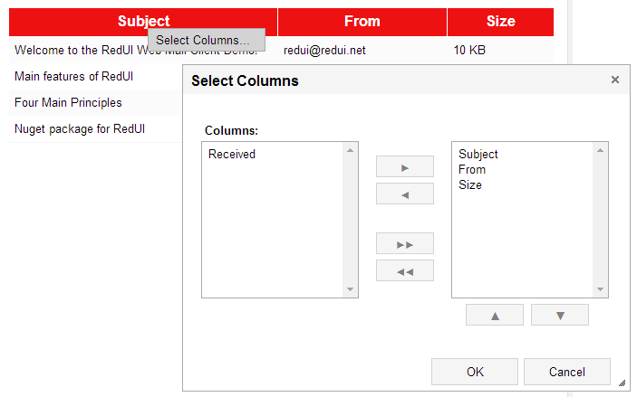
In addition to that, I will make customizeGridView the method of the IGridView interface, so it will be overridable too. (customizeGridView is called by the command bound to the "Select Columns..." menu item).
I feel that this gives a developer enough freedom and in the same time, if you don't do anything, it all just works.
From the programming point of view, the standard context menu can be overriden. It will only be used if left empty, otherwise, the context menu that you explicitly specified will be used.
In addition to that, I will make customizeGridView the method of the IGridView interface, so it will be overridable too. (customizeGridView is called by the command bound to the "Select Columns..." menu item).
I feel that this gives a developer enough freedom and in the same time, if you don't do anything, it all just works.
Friday, April 18, 2014
GridView customization: choosing the approach
What I want to do is to allow user to choose which columns are visible and in which order they should be shown. For that I am going to create a window with a ListBuilder, like this:

The question is how to activate this functionality?
The options I have:
This is something that I see in the Windows Explorer

The problem is, triggering this functionality should be as easy on touch screens as with the keyboard/mouse.
Second problem, it becomes an integrated part of the GridView and it is more difficult to make it optional.
This works in Windows Explorer too, and this is something you can find in many other applications, like VisualStudio or MS Outlook.

While it solves the "design problem", it doesn't completely solves other issues.
You can see this approach in Windows services console or task manager.

This gives a developer a freedom to enable/disable this feature, implement it differently and choose how it is triggered.
Of course, you don't get this feature for free anymore.
Something that I noticed, for the task manager in Windows 8, they moved this feature out of the main manu and now it is accessible through the context menu.
The good thing, I spare myself a lot of problems, like localization of that window. The bad thing... Well, I don't think anyone will ever get that far to even see this example.
So I am still choosing. Any suggestions, anyone?
The question is how to activate this functionality?
The options I have:
1. Add some visual element to the template
This could be nice, if I could find an elegant way to fit it into the current visual design (I am not saying it is amazing design now, I am saying that I might make it even worse).This is something that I see in the Windows Explorer
The problem is, triggering this functionality should be as easy on touch screens as with the keyboard/mouse.
Second problem, it becomes an integrated part of the GridView and it is more difficult to make it optional.
2. Add the context menu to every GridView column
This is one of the possible answers for the previous item. Instead of adding the completely new visual element, I could just add a context menu, which already exists.This works in Windows Explorer too, and this is something you can find in many other applications, like VisualStudio or MS Outlook.
While it solves the "design problem", it doesn't completely solves other issues.
3. Move this functionality completely out of the GridView and force developer to trigger it
In this case I simply implement the method that creates a window allowing to select/reorder columns, add it to the GridView and allow developer to call it when it is required.You can see this approach in Windows services console or task manager.
This gives a developer a freedom to enable/disable this feature, implement it differently and choose how it is triggered.
Of course, you don't get this feature for free anymore.
Something that I noticed, for the task manager in Windows 8, they moved this feature out of the main manu and now it is accessible through the context menu.
4. Do not implement this functionality at all.
This is also an option. I can simply create an example code that demonstrates how to do it, and that's it.The good thing, I spare myself a lot of problems, like localization of that window. The bad thing... Well, I don't think anyone will ever get that far to even see this example.
So I am still choosing. Any suggestions, anyone?
Tuesday, April 15, 2014
Control's Life
Today I will explain the life cycle of the redui control.
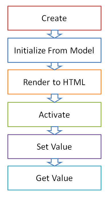
Create
At this stage control gets all the properties and methods.Most of the properties will be still empty, but the most important ones: id and the type should be set.
Initialize from model
At this point control model is validated and normalized.Optional model properties that were not provided are set to their default values. For example, TextBox label, if not provided, is set to "".
Also at this point has a chance to pre-calculate some values. For example, ComboBox options will be retrieved at this moment, packed into objects, stocked into the array and saved on the options property.
At last, it is a moment (and responsibility) of a control to create and initialize its inner controls.
Render to HTML
All the rendering logic is inside the template. If a control has inner controls, they should be rendered through the template.Activate
This is a time to subscribe to DOM events.One of the most important events is change, which allows databound control to update the object it is bound to.
As with the other stages, the control is responsible to activate every inner control!
Set Value
This will only happen for databound controls.All control has to do is to apply the passed value to the DOM element. For example, TextBox needs to set the value of its INPUT element.
Get Value
This will only happen for databound controls. Control needs to return the updated value from the DOM element.Welcome Back
It's been a while since I wrote to this blog.
So what happened since the last post?
So what happened since the last post?
- Now I have a website: redui.net
- I have a big section with examples which explain almost every feature of the library
- I have a demo application which shows what you can do
- I recorded couple of videos that no one is watching
- I have a nuget package that allows you to start development immediately
- I have people who come to my site:

- I have 8 people following me on codeplex
This is a incredibly motivating to see people coming, even for the short visit. So thank you all!
But I think it was a big mistake to stop blogging.
I will try to fix it.
Subscribe to:
Posts (Atom)